YouTube Video
The content is basically the same, but we introduce a few details such as how to create data.
Please check this out as well!
The MATLAB manual is still confusing, so I will summarize it. You can paste the code together into the command window.
intended audience
Prepare data in Excel
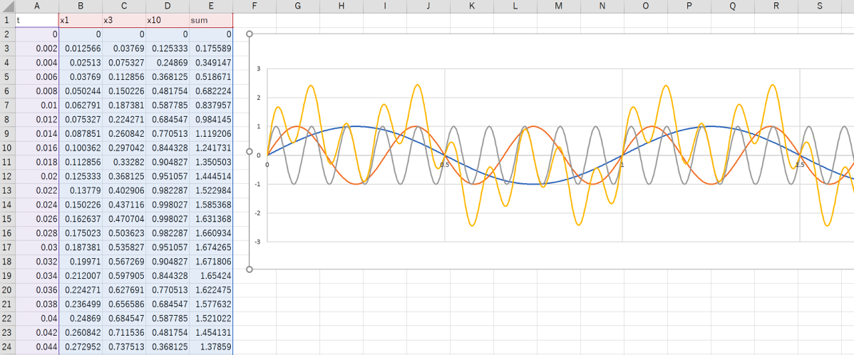
As an example here, we have three sin curves in Excel, each with a different frequency.
In this case, 1 Hz, 3 Hz, and 10 Hz were used.
The signal in column E (yellow), which is the sum of the two, is the target of the analysis.

Save the file as a CSV file, leaving only columns A and E.
The formulas for each column are as follows.
- Column B “=SIN(2*PI()*A2)”
- Column C “=SIN(2*PI()*3*A2)”
- Column D “=SIN(2*PI()*10*A2)”
- Column E “=SUM(B2:D2)”
You can copy and paste it directly into Excel. I will also upload the Excel file to my Github so you can use that as well.
https://github.com/buono/MATLAB_FFT
Data Import in MATLAB
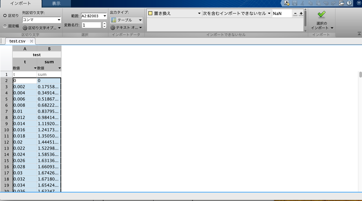
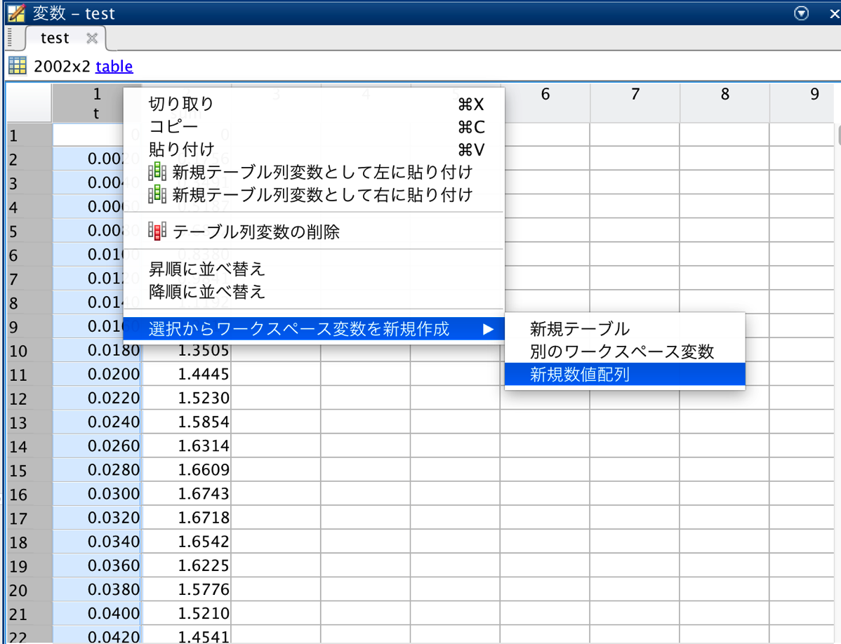
Import t and sum as arrays in MATLAB as follows, respectively.


Set the signal and plot
In this case, the following code was used to create signals up to 4 seconds at 0.002 second intervals.
T = 0.002; % sample period
L = 1001; % Number of signal points (note that it is not time!)
t = (0:L-1)*T; % time vector

Y = fft(sum);
P2 = abs(Y/L);.
P1 = P2(1:L/2+1);.
P1(2:end-1) = 2*P1(2:end-1);

Fs = 1/T;.
F = Fs*(0:(L/2))/L;.
plot(F,P1);.
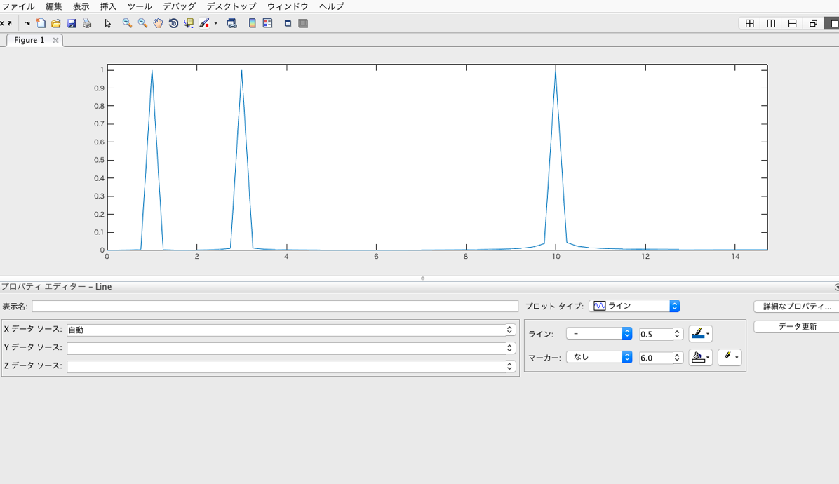
As shown below, we see peaks at 1Hz, 3Hz, and 10Hz.

 Start electronics


